Like pie charts, doughnut charts represent each category as a proportion of a whole. The member hierarchy in the Color drop zone drives the color of the segments, with each segment representing an element from the given hierarchy. The measure in the Values zone drives the size of the segments.
Building a Doughnut Chart
Before you begin
Create a new discovery from the User Hub, App Tabs, or on the right-click in the Content Explorer. As part of this process, you will need to open the appropriate Data Model for your analysis. For more information, see Access Discover Pro.
Step 1: Create your Basic Visual
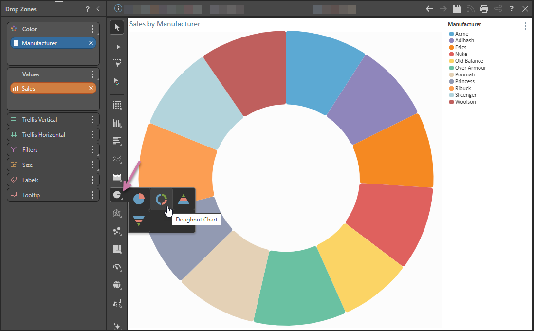
To set up the basic visual:
- Double-click a hierarchy in the Dimensions panel.
- Right-click Segment Chart > Doughnut Chart from the Toolbox (purple arrow below).
- Double-click or select the measure that you want to add in the Measures panel.
In this example, we're going to create a Doughnut Chart showing Sales by Manufacturer so this should be Manufacturer.
Step 2: Add More Hierarchies
To allow the reader to filter their report by date, drag a date-key hierarchy onto the Filters drop zone and use the submenu to create a Date Calendar:
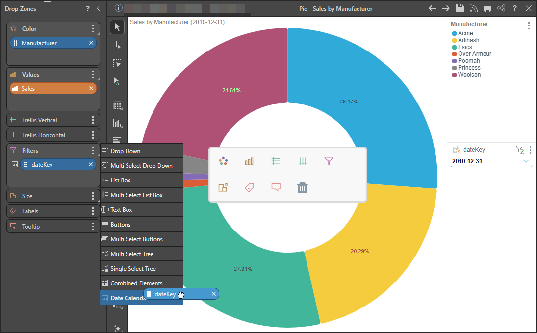
Note: This adds a Date Calendar to the canvas, which allows you to filter by date. For more information about the Date Calendar, see Date Calendars.
Related information
Segment Chart Formatting
Use the options in the Formatting Panel to add context to segment charts by enabling functions like data labels and multi-chart titles. Aside from the common formatting functions, the following formatting options are available specifically for the different types of segment charts: Background Color, Explode and Optimize, Arc Radius, and, for Doughnut Charts, Inner Radius.
- Click here for more information